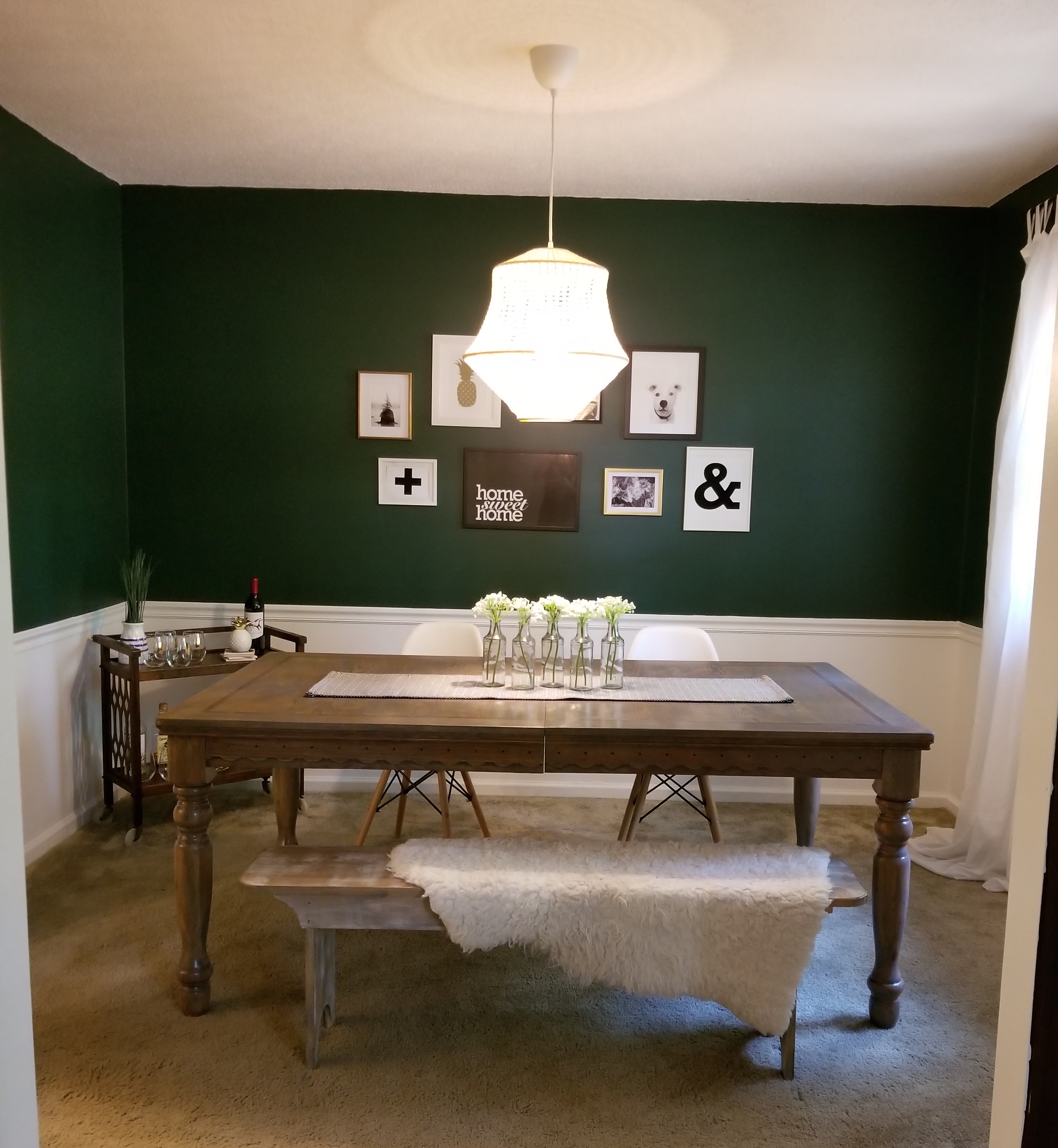
My eclectic dining room makeover is finally finished, and I couldn’t be happier with the outcome! The dining room was not high priority on my to-do list when we first moved into our house, but I’ll admit, I couldn’t stand it anymore. Day after day, I walked by a sad and empty beige room and I knew I had to work some design magic in there!
I’ve redone several spaces so far; my kitchen is bold and cheerful, the bathroom is moody and dark, and the basement is neutral and bright. However, I wanted to create a space that felt intimate, and cozy, while being bold and eclectic. I have been loving green for a while now, and once I found the perfect paint color for the space, it was easy as pie to pull together the rest,
As you all know, my makeovers are all budget makeovers, meaning I try to make the most impact with the smallest budget. I have many items I still want to add to this dining room; top of my list is replacing the carpet with wood flooring, changing the doorknob to a vintage crystal knob, and find a sunburst mirror for the back wall. However you also know, i’m impatient, and have been getting many questions about my dining room, so I wanted to share the final(ish) makeover!
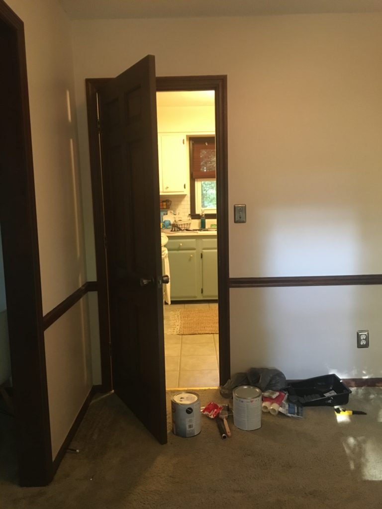
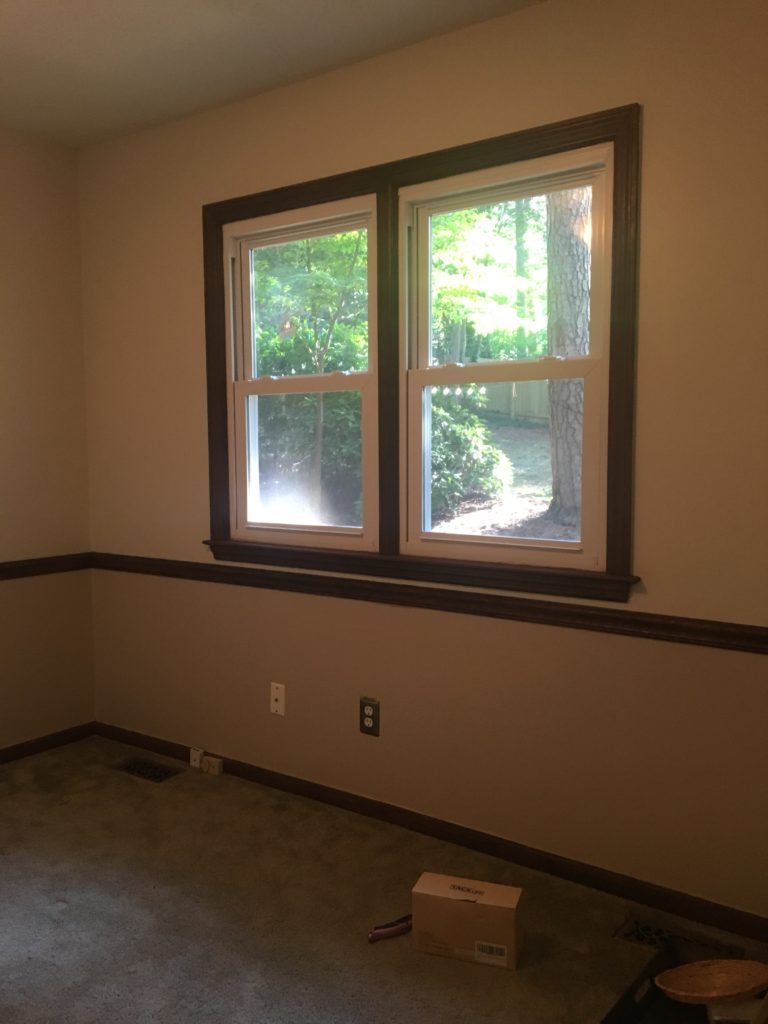
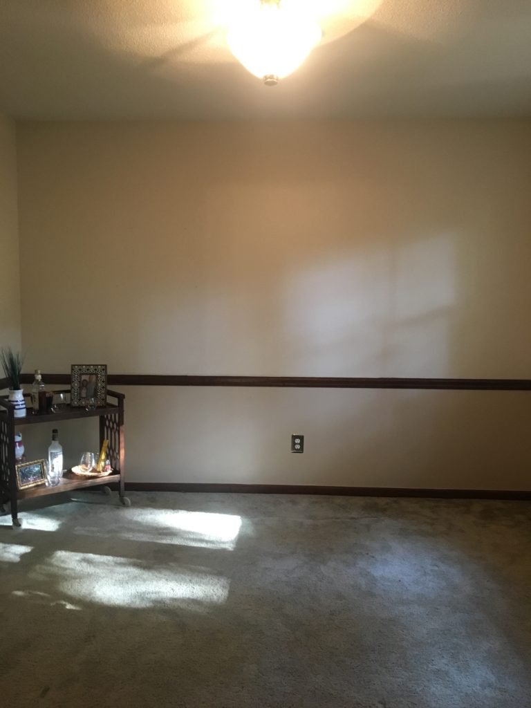
Before I dive into my kitchen makeover, let me first show you what it was up until about 2 weeks ago!
50 shades of beige; featuring my 1970’s dining room!
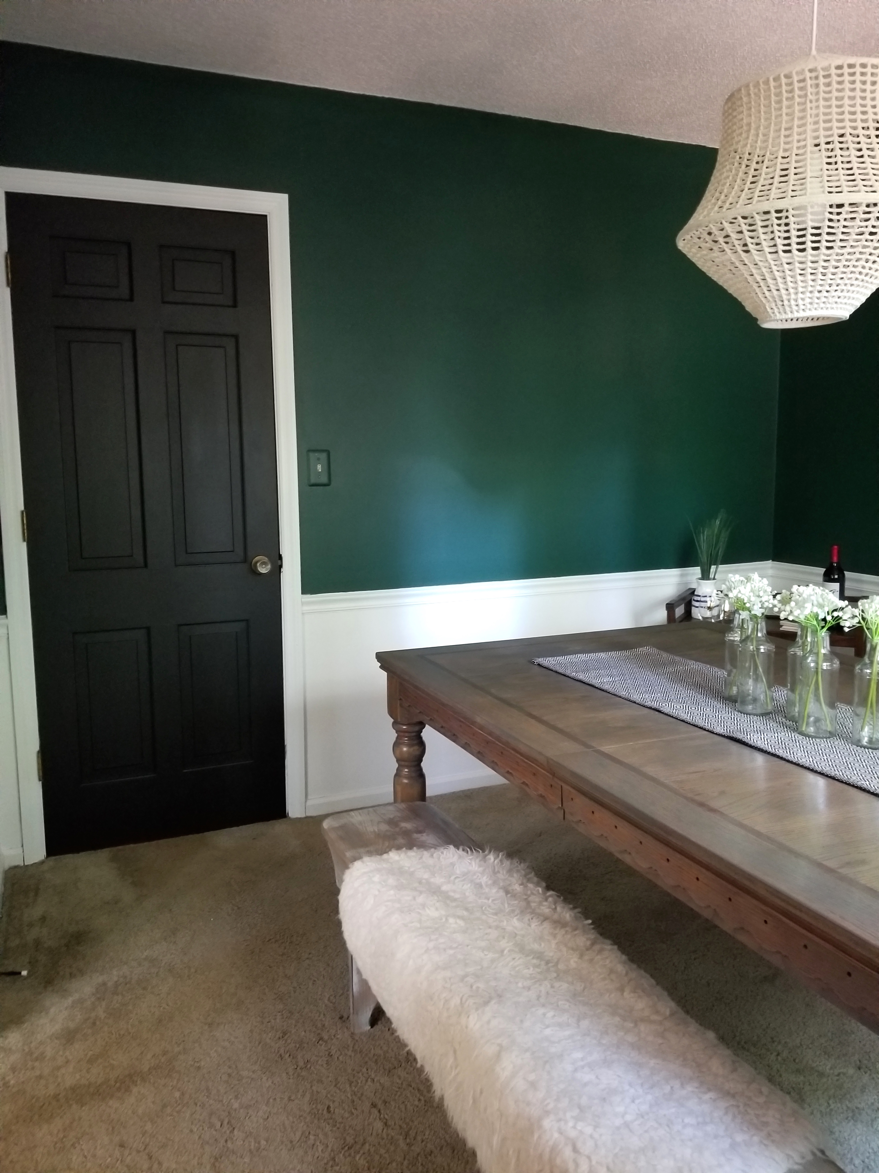
The first thing I did was paint the trim – which was quite the task. I didn’t bother taping the walls or door, because everything was getting painted in here!
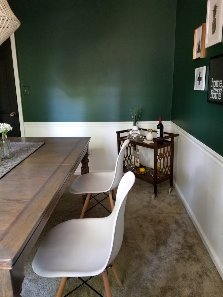
I love the bold contrast of dark green, white and black. It’s classic, yet very eclectic, and I felt it could flow into all my other spaces without being too dissimilar.
Paint Colors & Sheen
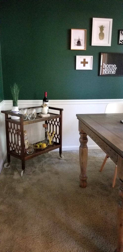
I used Valspar Perfect White in satin for the bottom half of the wall and for all the trim – I really wanted it all to flow which is why I didn’t use a different paint sheen. For the walls I used Glidden Deep Forest Pine in semi-gloss. I am so in love with the color and have gotten so many compliments on it that i’m considering it for other rooms in my house too! I highly recommend this color if you want to create a bold statement room. For the door I used Glidden Onyx Black in satin. I love the look of matte black, especially when contrasted against satin white trim! (This is also the color I used in my boho bathroom remodel a few months ago)
Seating
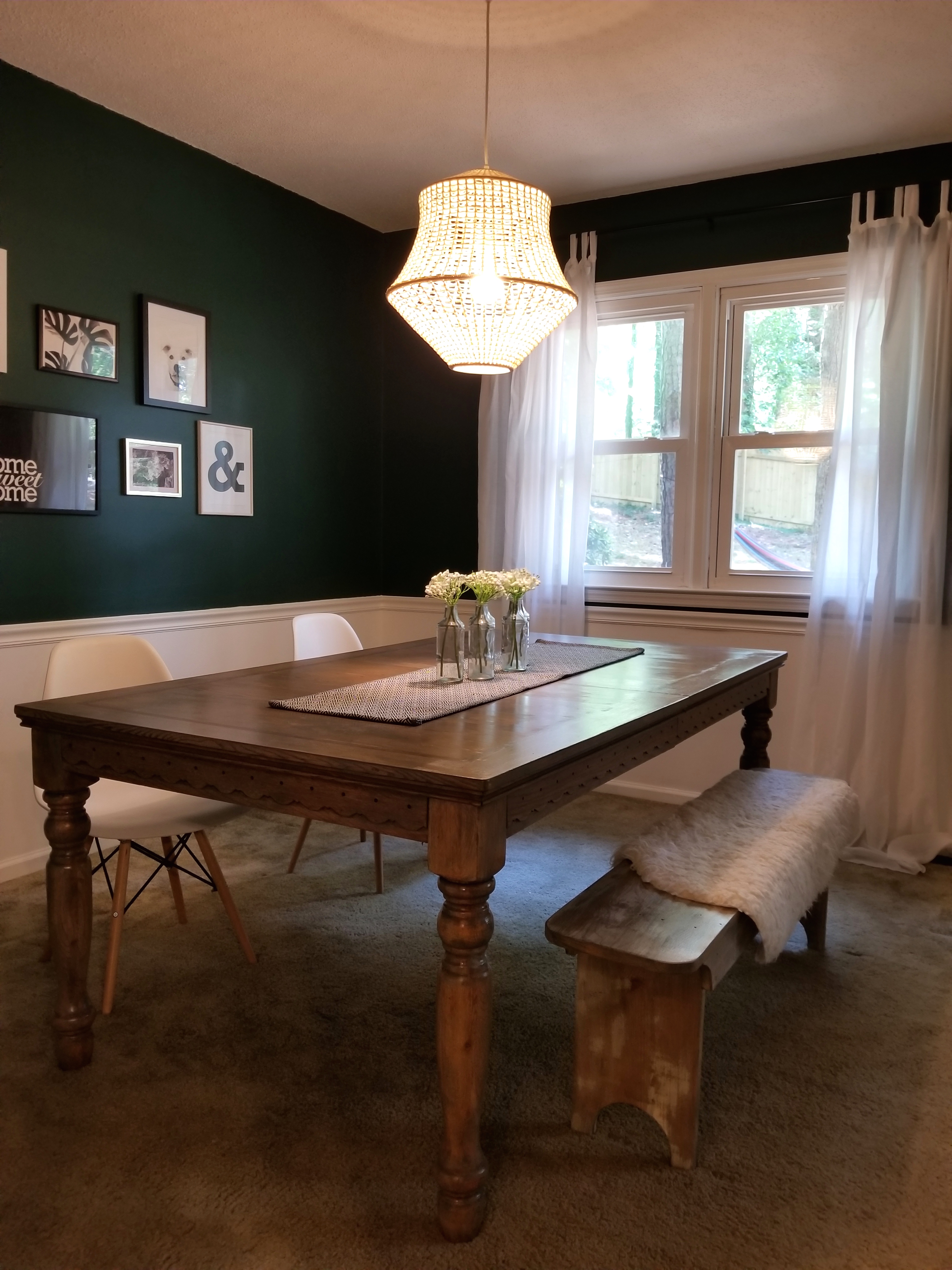
When I found this solid pine dining table secondhand for $50, I knew it was the one for this space. It looks very different from when I picked it up however, so If you haven’t seen what I started with, check out my dining room table transformation blog post here!
I love the look of mixed seating – so I used my existing molded plastic dining chairs (find them here!) and paired them with a flea market bench that I stained to match the dining table. I threw an IKEA faux sheep skin throw
over the bench for a little boho touch (and comfort) and all the seating was complete! I still would like to find two end chairs for the table, but currently it’s just me and my partner who dine here unless we are entertaining, so I have time to find the perfect chairs!
I found the key to mixing seating is to have a common element – even as simple as color, which in my case is what I used. I simply used white to pull it together – so next time you don’t have matching chairs, don’t fret – just rock it!
Gallery Wall
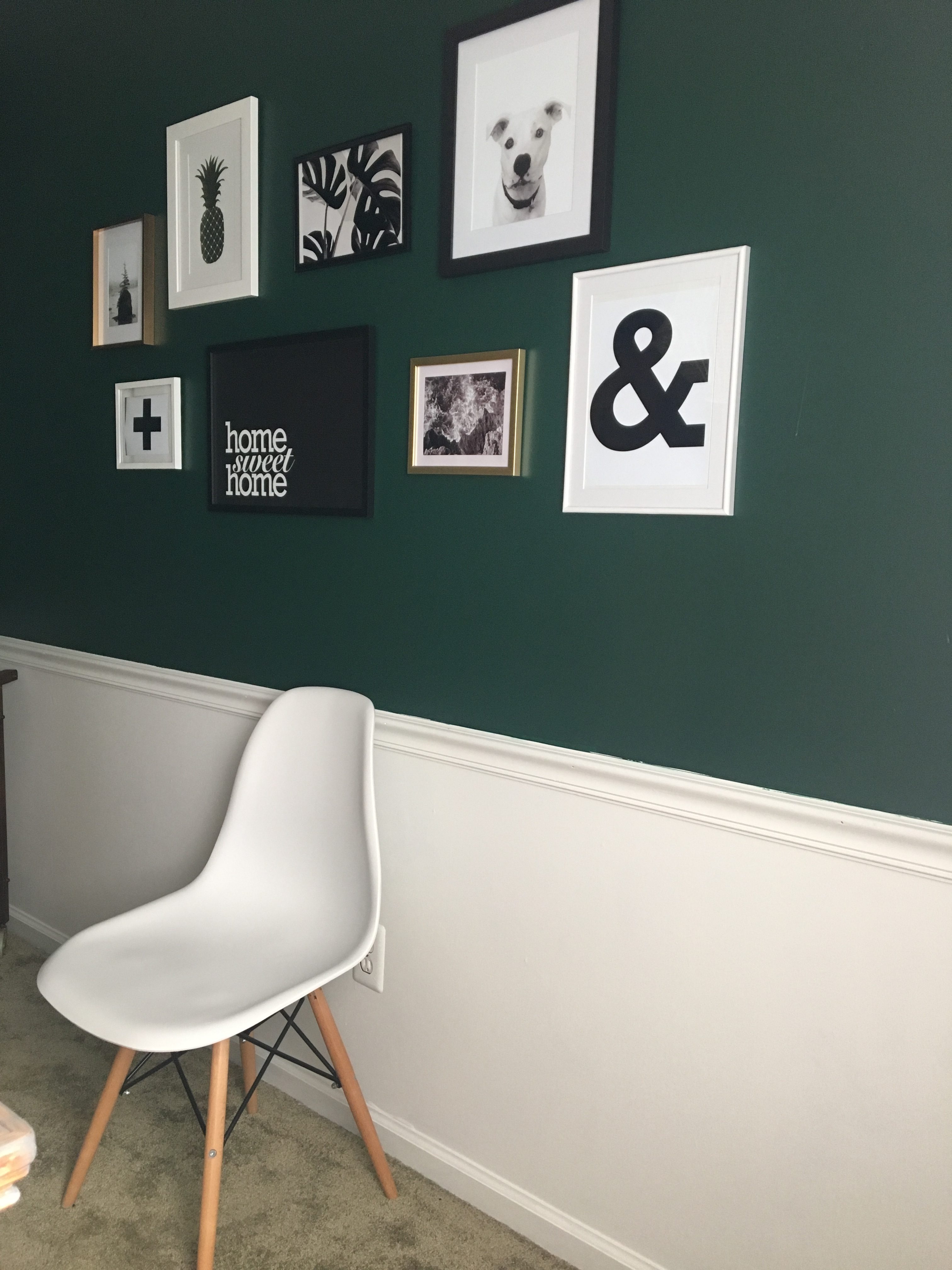
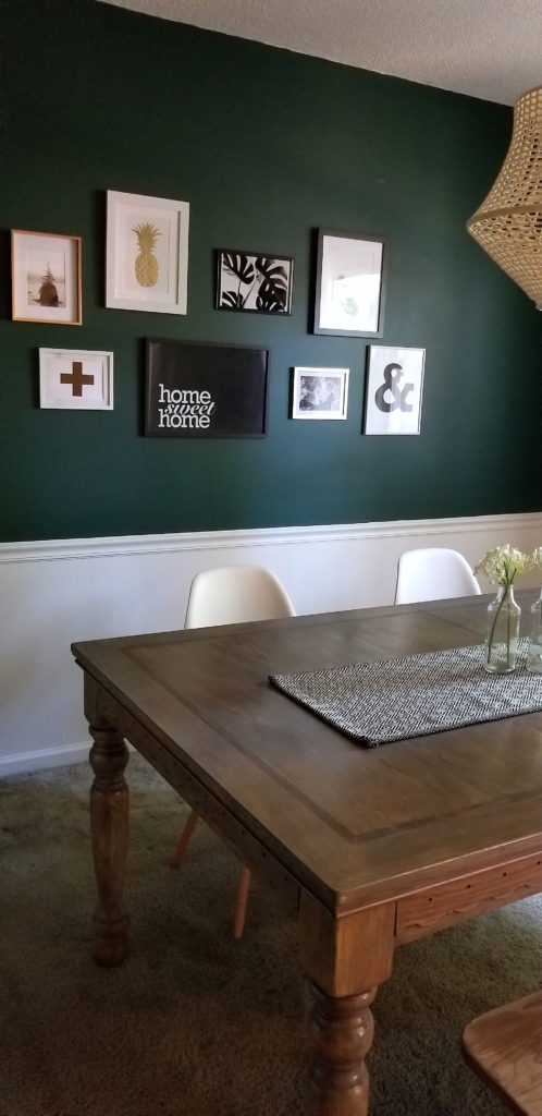
This is by far my favorite part of the dining space! I love this gallery wall. I used gold, white and black frames. I love adding a touch of glam, especially in a dining space, which is why I chose the gold. It’s really more brushed brass (duh!) and this helps all my spaces connect, because as you know, I use an element with brushed brass in every space.
I used all black and white prints and photography for this wall. The black and white really pops against the green, but compliments it all at the same time. I designed the graphic prints myself, and the picture of Wilbur was done by Perkie Prints – which is an amazing service I highly recommend. They turn your kid + pet portraits into really cool prints!
I spray painted a lot of my frames to be what I wanted – I only purchased two new frames for this wall, and I got them for $1 at The Dollar Tree!
Lighting + Decor
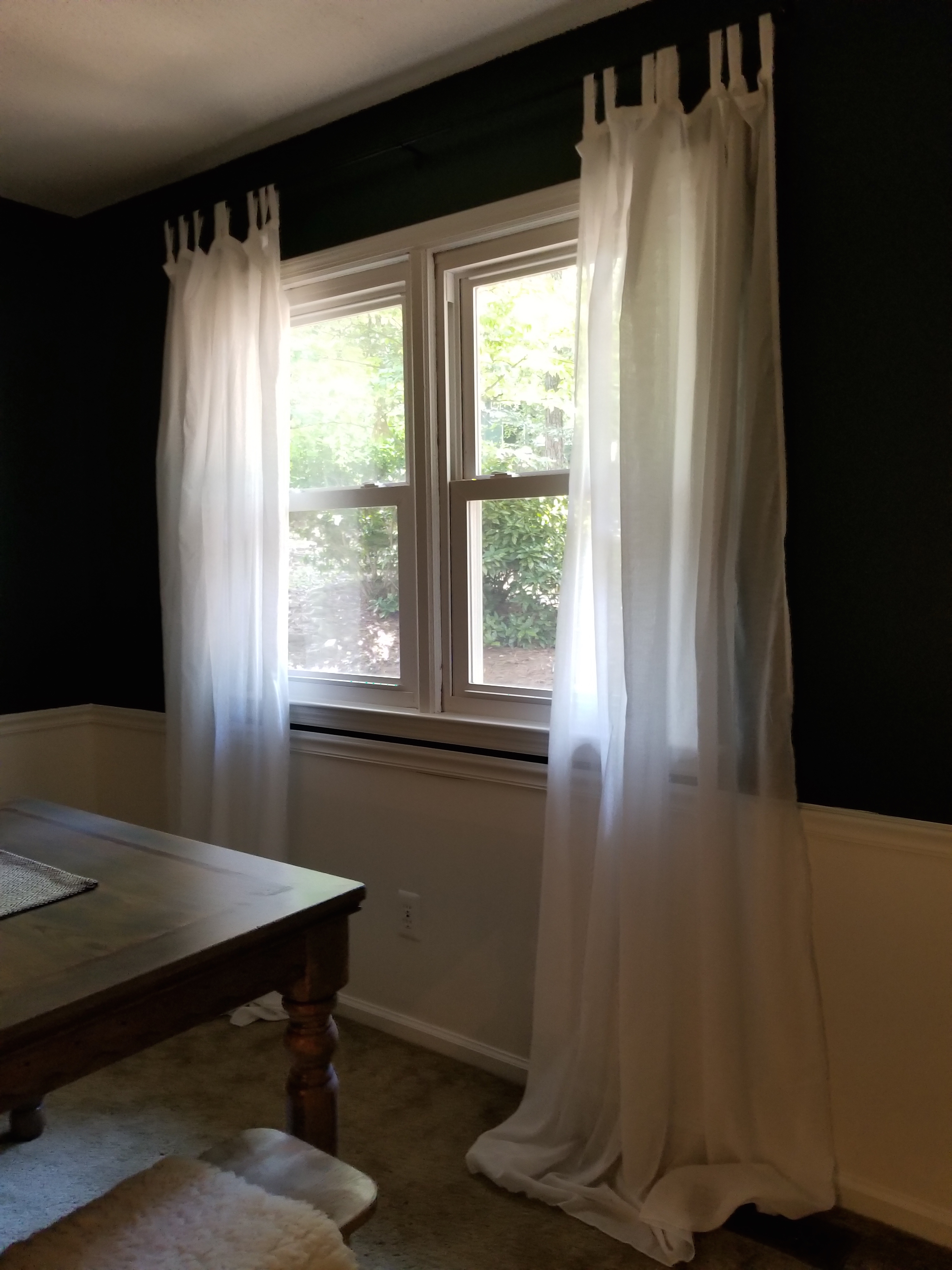
My dining space has a beautiful view of our backyard which is a rolling hill of trees, moss and magnolia bushes, so I didn’t want to block the view completely. As you may be able to tell from the photos, it also gets minimal sunlight, so I didn’t want to block any of that cherished natural light! That’s why I opted for white sheers from IKEA. I hung them 6 inches above the top of the trim, which opens up the window and lets optimal light in.
Speaking of light, this dining space had a standard ceiling light. Not even a cool 1970’s chandelier! But no worries – we swapped that out immediately for a woven pendant that I fell in love with at the IKEA showroom. When I saw it was only $29 too I almost bought 5 just because I loved it that much!
Changing this – without a doubt, made the room! It gives off a warm glow, but even cooler than that – because it’s woven, it casts a patterned shadow on the ceiling in the evening.
For the centerpiece, I decided to keep it simple. I just added a few glass bottle and white wild flowers (faux of course!) and set it all on an IKEA table runner.
Bar Cart
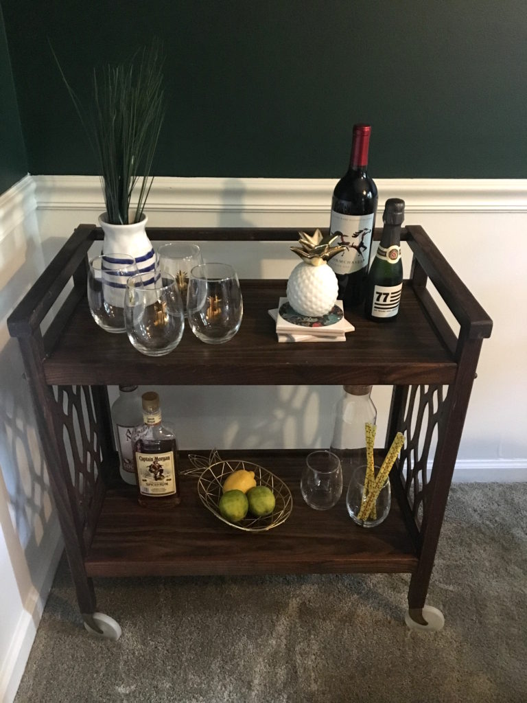
We didn’t have room for a buffet table, and honestly I didn’t need the storage for dining room items, so I just made the bar cart the star of the show! If you missed it – check out my 5- Step guide to styling your bar cart and see how I finished this one to match this dining room!
The bar cart has elements of white, gold and black, with simple greenery and items that I consider the finishing touch to this dining room.
I can’t wait to replace the carpet with hardwood and configure some final touches, but until then, this thrifty dining room has made my house one step closer to being my boho-eclectic haven!
Eclectic Dining Room Makeover √


1 Comment
Another winner!!! Love this space, Kat!!